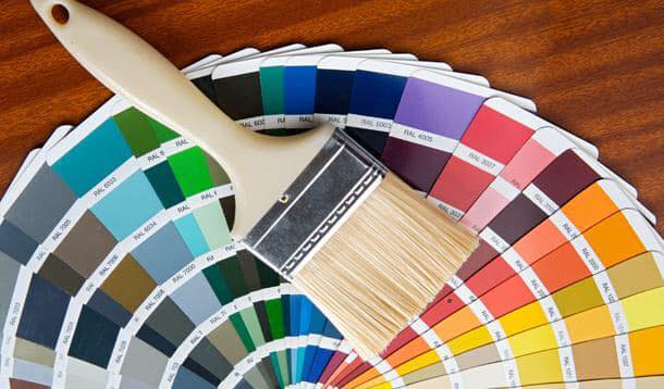
What Colours Attract Customers To Buy? Tips For Painting Your Retail Store

In an age dominated by online retailers, the notion that brick and mortar customers are looking for an experience couldn’t be more relevant. Their experience must be dominated by the senses; if sensory immersion didn’t matter, they would have just shopped online. Each retailer has its own draw – shoppers might want to smell your essential oils, feel your knit sweaters, or taste a freshly baked treat. Most of all, your customers want to be transported into a world of your creation – a world of excitement, or calm, or joy, or any number of other positive emotions you want them to feel. Every element of your environment will affect the customer, from the way you use accent lighting to the way you paint your walls. The colours your walls are painted can influence purchasing patterns through two related concepts: colour psychology and brand recognition.  

Colour Psychology

Why do fast food logos contain so much red and yellow while bank logos almost all incorporate blue? The answer is in colour psychology.   When you’re feeling blue, you’re in a melancholic, contemplative state. When you’re seeing red, you might not even have a chance to think before you act. You don’t want to catch someone in a black mood. We associate colours with all kinds of different emotions and cultural concepts, and you can use these to your advantage when considering how you want to paint your walls.   This article has been written for a North American audience; keep in mind that the ways in which colour affects emotion are deeply rooted in our cultural understandings of colour. While here, purple is mostly associated with nobility and wealth, Catholics in Brazil wear purple to funerals. The information presented here is, therefore, not a catch-all for how colours are perceived everywhere.   Different colours can have almost contradictory meanings, too.  While blue is often linked to melancholy, it is also linked to calm. In darker shades, it’s often linked to security and competence – perfect for banks. The expression “seeing red” means someone is angry, but seeing red can also make you hungry, which is why fast food logos use it so often.    Outside of affecting emotional states, colours can signal qualities based on cultural norms, too. The old trope that baby boys wear blue and baby girls wear pink is a perfect example of this – children’s toys and packaging often follow this same two-colour dichotomy. Novelty seekers will often look for packaging with unusual colours; after all, why use unusual colours unless you have an unusual product? Colours don’t just incentivize buying; they tell us what it is we’re getting.   There are, then, two core considerations that should drive how you paint your retail space: how you want your customer to feel and what your customer is buying. A store full of novelty candies should be painted in teals and purples and other unusual colours – you want a bright, cheerful, novel environment. Everything your customer purchases will seem that much more unique and fun. Conversely, if you’re a high-end retailer, you can focus on black, white, and gold and everything will feel more elegant.   

Brand Recognition

All of this talk of colour psychology has probably already influenced at least one important decision for your business: the colours of your logo. You might not want to create a interior colour scheme that looks exactly like your logo (imagine if every McDonalds had red and yellow interior walls), but you should choose colours that work well with the colours in your logo.    Think about the inside of a Starbucks: there’s usually a lot of brown (in the form of wood), black, and white. All of these colours play perfectly with a splash of green; sometimes it’s an accent wall, sometimes they have their logo painted on the wall, sometimes it’s the furniture. This reminds consumers that they’re in a Starbucks. In the same way, when people see the Starbucks logo, they think of a cozy but sophisticated feel. Creating unconscious links between your brand and your interior design is powerful.   Neutrals, then, are a powerful tool in the retail painting toolbox. You’ll often want to reinforce brand identity through nothing more than an accent wall – too much colour can be overstimulating. You’ll want to consider all the fixtures in your space along with your walls. How will the colour of furniture tie in with the colour of your walls? When you want a particular piece to stand out, use a neutral wall colour and accent lighting. When you want to tie brand identity with the experience your customer is immersed in, light up an accent wall that uses one of your logo’s colours.  

Some Practical Considerations

Once you’ve decided on what colours you want, it’s time to get down to painting. You’ll want to find a good contractor; you would do well to find one with a lot of commercial experience. Discuss your vision for the interior with them. You’ll often be able to find contractors who will do a colour consultation with you in order to help you incorporate the colours you’ve chosen to influence buying behaviours.    Not all paint is the same; the best paint for retail stores will vary depending on what you sell and who your clients are. Some stores benefit from advertising the eco-friendly paint they use. Others might benefit from using scuff-resistant paint. You’ll always want to use long-lasting, high-quality paints that dry relatively quickly.   There are several techniques you can use to avoid interrupting business when you paint. Find contractors who are willing to work when your retail space is closed. If that’s impossible, section off areas to be painted so that you can still stay open for business. Business interruption insurance can help with many things, but it doesn’t cover business that you’ve lost because you opted to renovate.   

Leave a Reply

Your email address will not be published. Required fields are marked *